# Load libraries
library(tidyverse)
library(cowplot)Creating Many ggplots from One Excel File in R
Description: In this qmd, I take one Excel file sent to me by the Judgement, Decision, & Social Comparison Lab PI and I use it to create 9 ggplots in one R script.
Introduction
The Judgement, Decision, & Social Comparison Lab in the University of Iowa Department of Psychological and Brain Sciences is interested in creating a tool for sequential and visual decision-making. I have been working to create visualizations and a Shiny application for the lab. Learn more about the project here. Recently, the PI needed iterative example bar charts for different types of decisions in order to test a particular visualization type. The PI intended to have undergraduate research assistants create these charts by hand in PowerPoint, but I offered to create a script to loop through making these plots with ggplot. Here, I share that process. This post has been approved by the PI.
The Data
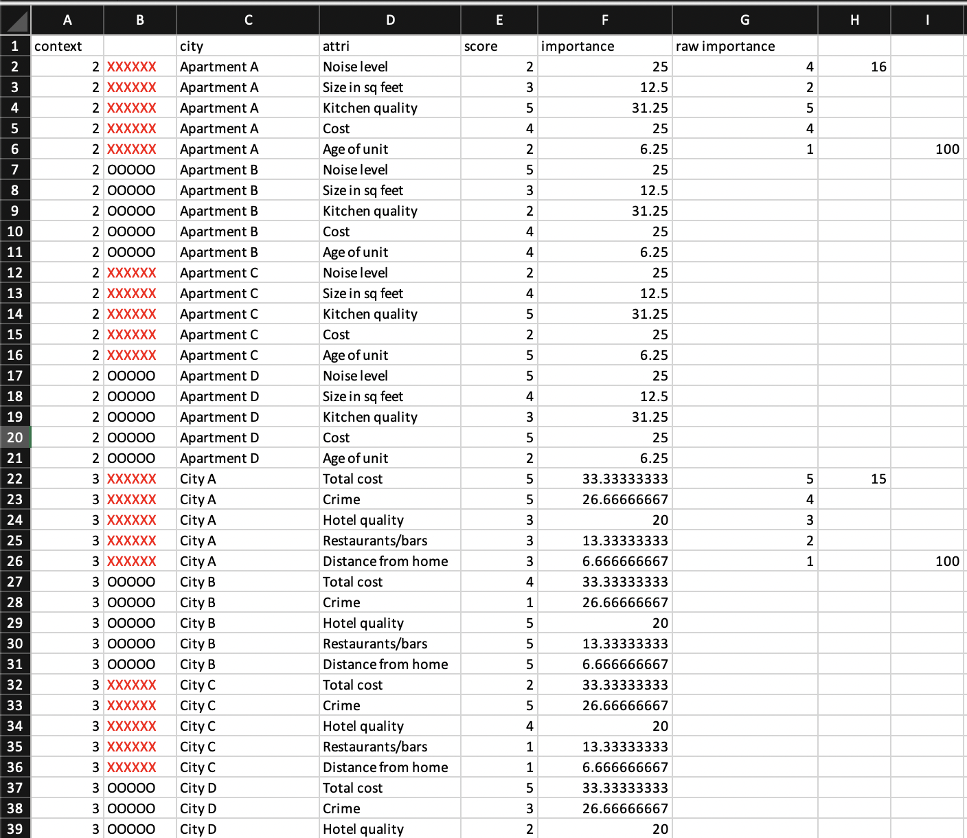
The data here are crafted from the PI in order to test a particular type of visualization for making decisions. He sent me the following excel file which I saved as a csv and read in to R.
Methods
I start by loading necessary packages. I need readr, dplyr, and ggplot from the tidyverse, so I chose to load the tidyverse packages to read, clean, and plot data. I use cowplot to combine two plots.
Next, I read in the data, do some slight cleaning, and select for the columns I want to keep.
# Set data directory on local machine (this should be where ever you keep your data)
#data_dir <- insert your file path to your data
# Specify the directory where you want to save the CSV files
#output_directory <- insert your file path to your data-save location
# Set directory for saving images from loop
#save_dir <- insert you file path to your images folder

# Read in data file
full_dat <- read_csv(file.path(data_dir, "paul-data.csv"))
selected_dat <- full_dat %>%
  select(c("context", "city", "attri", "score", "importance")) %>% # select only for relevant rows
  mutate(score = (score -1) * 25) %>% # the score was accidentally provided from 1-5 rather than 0-100, here I fix that
  rename("choice" = "city") # this column should be labeled choice, as not all examples are cities
There are 9 examples here within one Excel file, but we need 9 seperate graphs. I chose to save each example as it’s own csv file. This is not necessary, but it made sense to do within the context of an already existing workflow for the project. To split the dataframe on “context” (the example id) and save as as csvs, I created a set of two loop.
# Get unique levels in the "context" column
context_levels <- unique(selected_dat$context)

# Create an empty list to store the dataframes
context_list <- list()

# Loop through each context level
for (level in context_levels) {
  # Subset the dataframe based on the current context level
  subset_df <- selected_dat[selected_dat$context == level, ]

  # Add the subsetted dataframe to the list
  context_list[[as.character(level)]] <- subset_df
}

# Now, context_list is a list of dataframes, where each dataframe corresponds to a context level

# Loop through each element in context_list
for (i in seq_along(context_list)) {
  # Create a filename based on the context level
  filename <- paste0(output_directory, "context_", names(context_list)[i], ".csv")

  # Save the dataframe as a CSV file
  write.csv(context_list[[i]], file = filename, row.names = FALSE)
}
Now that I have the original data organized a bit better, I read it into another script to begin plotting. I started this process by making a plot for one of the data sets, and then I built that into a loop. First I will show the plotting steps. Below is the plot that the PI wanted me to recreate.
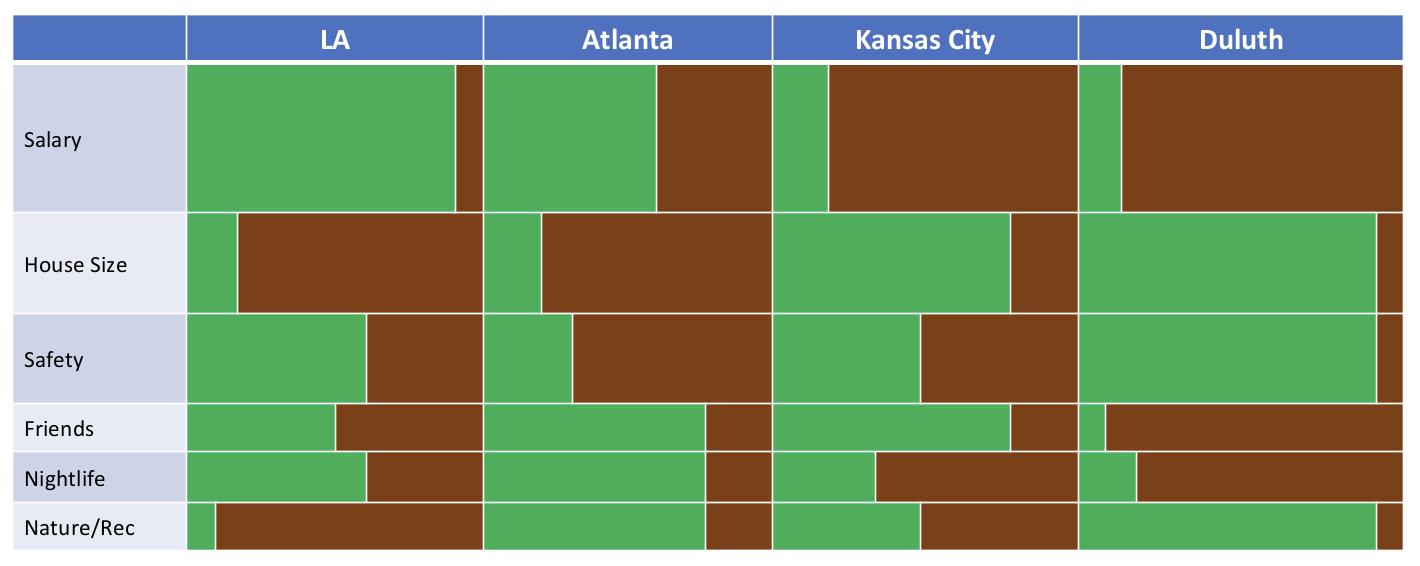
This plot has a “positive side” indicated in green, and a “negative” side indicated in brown. This deliniation between positive and negative will be decided by the user of the the tool and the person making the decision. For example, if someone has four job offers in different cities, LA, Duluth, Atlanta, and Kansas City, that person will need to decide where to accept a job. Suppose the jobs themselves are similar, but differ in salaries. The salary is one aspect of the decision-making process, and the decision-maker will have to indicate how positive or negative the salary is for each position. Within the proposed tool, the decision maker would score each of the salary options. Additionally, the user will need to indicate how important each attribute of the decision is to them. For many, salary would be more important than nightlife in a given city. The attribute importance is shown by the width of the bar. Thus, the area of each green bar is equal to the importance of the attribute (salary vs nightlife) times the score of the option (50,000 dollars vs 75,000 dollars).
The PI also requested that a slight margin/buffer be added in so even values of 0 have a little green, and even values of 100 have a little brown.
To start mimicking this plot, I read in the data, and calculate the negative score based on the positive score out of 100. I also specifiy and arrange by the order specified in the dataframe as requested by the PI.
# Read in data file
dat_read <- read_csv(file.path(output_directory, "context_2.csv")) # This uses file path from above + file name

# Add the negative score by subtracting score from 100
dat_read$neg_score <- 100 - dat_read$score

# Specifiy and arrange by the order specified in the dataframe (requested by PI)
plotting_order <- c(dat_read$attri[5], dat_read$attri[4], dat_read$attri[3], dat_read$attri[2], dat_read$attri[1])

dat <- dat_read %>%
  mutate(attri = factor(attri, levels = plotting_order)) %>%
  arrange(choice, attri)
After trying a number of attempts to plot the resulting data with geom_bar and geom_col and many internet searches, I came to a conclusion that ggplot does not appear to support differing bar widths on stacked bar chars. This lovely post from The R Graph Gallery provided an alternative option: plotting rectangles. I took a slightly different approach to calculating the widths and heights, but the gist is the same. Below, I calculate the start and end point of each rectangle in the x and y direction based on the data values.
  # All bars will start at -5 (for plot buffer) in the x
  dat$x_pos_start <- -5

  # Positive bars will end at their given score in the x
  dat$x_pos_end <- dat$score

  # Negative bars will end at the positive score in the x
  dat$x_neg_start <- dat$score

  # All bars will end at 105 (for plot buffer) in the x
  dat$x_neg_end <- dat$score + dat$neg_score + 5


  # Create a smaller table that highlights the importance score of each attribute
  imps <- dat %>%
    select("attri", "importance") %>% # Select the columns we want
    slice(1:5) # Select only the first 6 rows since these data repeat throughout the dateframe

  # The y locations of the boxes we will plot will depend on the importance. Also, these need to build up so the boxes do not overlap. Here I create 5 (technically 6) heights to denote where those breaks will occur.
  height0 <- 0
  height1 <- height0 + imps$importance[1]
  height2 <- height1 + imps$importance[2]
  height3 <- height2 + imps$importance[3]
  height4 <- height3 + imps$importance[4]
  height5 <- height4 + imps$importance[5]

  # Make a vector of these break points for the starting y location for each box
  y_starts <- c(height0, height1, height2, height3, height4)
  # Make a vector of these break points for the ending y location for each box
  y_ends <- c(height1, height2, height3, height4, height5)
  # Repeat that start location 4 times and add to the dataframe
  dat$y_start <- rep(y_starts, 4)
  # Repeat that end location 4 times and add to the dataframe
  dat$y_end <- rep(y_ends, 4)


  # Calculate where each tick mark for plot labeling will appear -- we want these in the middle of each box for each attribute
  label_heights <- c((height1 + height0) / 2,
                     (height2 + height1) / 2,
                     (height3 + height2) / 2,
                     (height4 + height3) / 2,
                     (height5 + height4) / 2)
Now I have the resulting data (rows 1:8 displayed):
| context | choice | attri | score | importance | neg_score | x_pos_start | x_pos_end | x_neg_start | x_neg_end | y_start | y_end |
|---|---|---|---|---|---|---|---|---|---|---|---|
| 2 | Apartment A | Age of unit | 25 | 6.25 | 75 | -5 | 25 | 25 | 105 | 0.00 | 6.25 |
| 2 | Apartment A | Cost | 75 | 25.00 | 25 | -5 | 75 | 75 | 105 | 6.25 | 31.25 |
| 2 | Apartment A | Kitchen quality | 100 | 31.25 | 0 | -5 | 100 | 100 | 105 | 31.25 | 62.50 |
| 2 | Apartment A | Size in sq feet | 50 | 12.50 | 50 | -5 | 50 | 50 | 105 | 62.50 | 75.00 |
| 2 | Apartment A | Noise level | 25 | 25.00 | 75 | -5 | 25 | 25 | 105 | 75.00 | 100.00 |
| 2 | Apartment B | Age of unit | 75 | 6.25 | 25 | -5 | 75 | 75 | 105 | 0.00 | 6.25 |
| 2 | Apartment B | Cost | 75 | 25.00 | 25 | -5 | 75 | 75 | 105 | 6.25 | 31.25 |
| 2 | Apartment B | Kitchen quality | 25 | 31.25 | 75 | -5 | 25 | 25 | 105 | 31.25 | 62.50 |
Great! Now I plot.
 # Create the plot with the data! Save as variable "plot"
  plot <- ggplot(dat) + # Initiate a ggplot with our data
    geom_rect(aes(xmin = x_pos_start, # for each positive data point define the x start location for the box
                  xmax = x_pos_end, # define the x end location for the box
                  ymin = y_start, # define the y start location for the box
                  ymax = y_end), # define the y end location for the box
              fill = "#05af50", # color the positive boxes green
              color = "white") + # outline the boxes with white
    geom_rect(aes(xmin = x_neg_start, # # for each negative data point define the x start location for the box
                  xmax = x_neg_end, # define the x end location for the box
                  ymin = y_start, # define the y start location for the box
                  ymax = y_end), # define the y end location for the box
              fill = "#833c0c", # color the negative boxes brown
              color = "white") + # outline the boxes with white
    facet_wrap(~choice,
               nrow = 1) + # facet wrap the plot by city with 1 row
    theme(panel.grid = element_blank(), # remove the panel background
          axis.text.y = element_text(size = 12, vjust = 0.5), # control the y axis text
          axis.text.x = element_blank(), # remove x axis text
          axis.ticks.x = element_blank(), # remove x axis tick marks
          strip.text = element_text(size = 12,
                                    face = "bold")) + # control facet choice labels
    scale_y_continuous(breaks = label_heights, # use the label_heights we calculated above to place y axis labels
                       labels = plotting_order) # add the desired y axis labels in the correct order using vector stored above
plot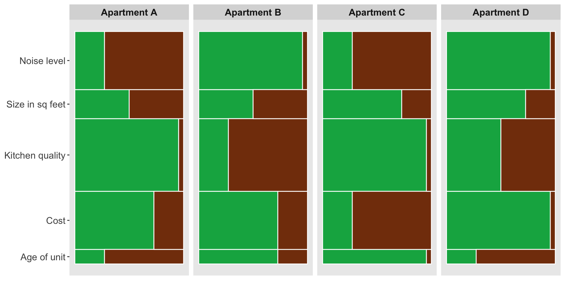
This is nice, but I want to get as close as I possibly can to the example plot.
  # Create the plot with the data! Save as variable "plot"
  plot <- ggplot(dat) + # Initiate a ggplot with our data
    geom_rect(aes(xmin = x_pos_start, # for each positive data point define the x start location for the box
                  xmax = x_pos_end, # define the x end location for the box
                  ymin = y_start, # define the y start location for the box
                  ymax = y_end), # define the y end location for the box
              fill = "#05af50", # color the positive boxes green
              color = "white") + # outline the boxes with white
    geom_rect(aes(xmin = x_neg_start, # # for each negative data point define the x start location for the box
                  xmax = x_neg_end, # define the x end location for the box
                  ymin = y_start, # define the y start location for the box
                  ymax = y_end), # define the y end location for the box
              fill = "#833c0c", # color the negative boxes brown
              color = "white") + # outline the boxes with white
    facet_wrap(~choice,
               nrow = 1) + # facet wrap the plot by city with 1 row
    theme(plot.background = element_rect(fill = "white"),
          panel.grid = element_blank(), # remove the panel background
          axis.text.y = element_blank(), # control the y axis text
          axis.text.x = element_blank(), # remove x axis text
          axis.ticks = element_blank(), # remove x axis tick marks
          strip.text = element_text(size = 12,
                                    face = "bold",
                                    color = "white"),
          strip.background = element_rect(fill = "#4472c4", color = "white"),
          panel.spacing.x=unit(0.1, "lines"),
          plot.margin = unit(c(0.5, 0.5, 0.5, 0), "cm")) + # control facet choice labels
    scale_y_continuous(breaks = label_heights, # use the label_heights we calculated above to place y axis labels
                       labels = plotting_order, # add the desired y axis labels in the correct order using vector stored above
                       expand = expansion(mult = 0)) + # remove padding to y axis
  scale_x_continuous(expand = expansion(mult = 0)) # remove padding to x axis

# Set axis color pattern
axis_colors <- rep(c("#e8ebf5", "#ccd4ea"), 10)

# Create y-axis rectangles
y_axis <- ggplot(dat) +
  geom_rect(aes(xmin = -10,  # x start location
                xmax = -5, # x end location
                ymin = y_start, # y start location matching above
                ymax = y_end), # y end location matching above
            fill = axis_colors, # fill with color pattern
            color = "white") + # set outline color
  annotate("text", # add labels as annotation
           x = -9.8, # text start location
           y = label_heights, # text height
           label = plotting_order, # label order same as above
           hjust = 0,
           size = 4.5) +
  theme(panel.background = element_blank(), # empty panel
        plot.background = element_rect(fill = "white"), # white background
        axis.title = element_blank(), # remove axis title
        axis.text = element_blank(), # remove axis text
        axis.ticks = element_blank(), # remove axis ticks
        plot.margin = unit(c(0, 0, 0, 0.5), "cm")) + # remove space except left margin
      scale_y_continuous(expand = expansion(mult = 0)) + # remove padding to y axis
  scale_x_continuous(expand = expansion(mult = 0)) # remove padding to x axis

# Combine the two plots
com_plot <- cowplot::plot_grid(y_axis, plot,
                   align = "hv",
                   axis = "tb",
                   rel_widths = c(1,5))
# Plot!
com_plot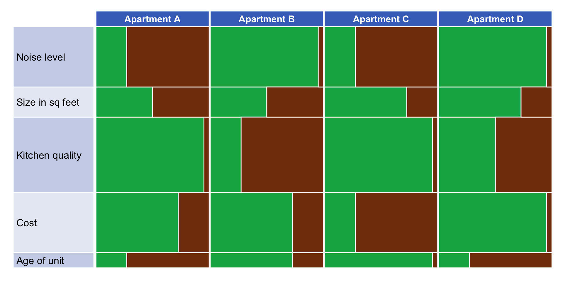
Again, great! Now, I need to make a loop.
# Initialize a list to store the plots
plot_list <- list()

# Loop over datasets
for (i in 2:10) {
  # Read in data file
  dataset_file <- paste0("context_", i, ".csv")
  dat_read <- read_csv(file.path(output_directory, dataset_file))

  # Add the negative score by subtracting score from 100
  dat_read$neg_score <- 100 - dat_read$score

  # Set order based on dataframe order
  plotting_order <- c(dat_read$attri[5], dat_read$attri[4], dat_read$attri[3], dat_read$attri[2], dat_read$attri[1])

  # Create new dataframe to manipulate -- we want to add columns to know where rectangle start and end locations should be. We will build this plot by drawing rectangles rather then a normal bar plot. Apparently ggplot does not support stacked bar/col plots with varying widths: https://r-graph-gallery.com/81-barplot-with-variable-width.html

  # (Not used here) Start by arranging data by city and then importance (will arrange by city first then within city arrange attributes by importance level)
  #dat <- dat_read %>%
  #arrange(choice, importance)

  # Arrange by the order specified in the dataframe
  dat <- dat_read %>%
    mutate(attri = factor(attri, levels = plotting_order)) %>%
    arrange(choice, attri)

  # All bars will start at -5 (for plot buffer) in the x
  dat$x_pos_start <- -5

  # Positive bars will end at their given score in the x
  dat$x_pos_end <- dat$score

  # Negative bars will end at the positive score in the x
  dat$x_neg_start <- dat$score

  # All bars will end at 105 (for plot buffer) in the x
  dat$x_neg_end <- dat$score + dat$neg_score + 5


  # Create a smaller table the highlights the importance score of each attribute
  imps <- dat %>%
    select("attri", "importance") %>% # Select the colomns we want
    slice(1:5) # Select only the first 6 rows since these data repeat throughout the dateframe

  # The y locations of the boxes we will plot will depend on the importance. Also, these need to build up so the boxes do not overlap. Here I create 5 (technically 6) heights to denote where those breaks will occur.
  height0 <- 0
  height1 <- height0 + imps$importance[1]
  height2 <- height1 + imps$importance[2]
  height3 <- height2 + imps$importance[3]
  height4 <- height3 + imps$importance[4]
  height5 <- height4 + imps$importance[5]

  # Make a vector of these break points for the starting y location for each box
  y_starts <- c(height0, height1, height2, height3, height4)
  # Make a vector of these break points for the ending y location for each box
  y_ends <- c(height1, height2, height3, height4, height5)
  # Repeat that start location 4 times and add to the dataframe
  dat$y_start <- rep(y_starts, 4)
  # Repeat that end location 4 times and add to the dataframe
  dat$y_end <- rep(y_ends, 4)


  # Calculate where each tick mark for plot labeling will appear -- we want these in the middle of each box for each attribute
  label_heights <- c((height1 + height0) / 2,
                     (height2 + height1) / 2,
                     (height3 + height2) / 2,
                     (height4 + height3) / 2,
                     (height5 + height4) / 2)

  # Pull the attributes in the order they appear in the table (after arranging in early step) and store as vector -- this will be needed for plotting
  #labels <-as_vector(imps$attri) -- dont use this unless trying to order by importance (biggest at top)  && must be using   '#dat <- dat_read %>% #arrange(choice, importance)'   from above (lines 27-28)


  # Create the plot with the data! Save as variable "plot"
  plot <- ggplot(dat) + # Initiate a ggplot with our data
    geom_rect(aes(xmin = x_pos_start, # for each positive data point define the x start location for the box
                  xmax = x_pos_end, # define the x end location for the box
                  ymin = y_start, # define the y start location for the box
                  ymax = y_end), # define the y end location for the box
              fill = "#05af50", # color the positive boxes green
              color = "white") + # outline the boxes with white
    geom_rect(aes(xmin = x_neg_start, # # for each negative data point define the x start location for the box
                  xmax = x_neg_end, # define the x end location for the box
                  ymin = y_start, # define the y start location for the box
                  ymax = y_end), # define the y end location for the box
              fill = "#833c0c", # color the negative boxes brown
              color = "white") + # outline the boxes with white
    facet_wrap(~choice,
               nrow = 1) + # facet wrap the plot by city with 1 row
    theme(plot.background = element_rect(fill = "white"),
          panel.grid = element_blank(), # remove the panel background
          axis.text.y = element_blank(), # control the y axis text
          axis.text.x = element_blank(), # remove x axis text
          axis.ticks = element_blank(), # remove x axis tick marks
          strip.text = element_text(size = 12,
                                    face = "bold",
                                    color = "white"),
          strip.background = element_rect(fill = "#4472c4", color = "white"),
          panel.spacing.x=unit(0.1, "lines"),
          plot.margin = unit(c(0.5, 0.5, 0.5, 0), "cm")) + # control facet choice labels
    scale_y_continuous(breaks = label_heights, # use the label_heights we calculated above to place y axis labels
                       labels = plotting_order, # add the desired y axis labels in the correct order using vector stored above
                       expand = expansion(mult = 0)) + # remove padding to y axis
  scale_x_continuous(expand = expansion(mult = 0)) # remove padding to x axis

# Set axis color pattern
axis_colors <- rep(c("#e8ebf5", "#ccd4ea"), 10)

# Create y-axis rectangles
y_axis <- ggplot(dat) +
  geom_rect(aes(xmin = -10,  # x start location
                xmax = -5, # x end location
                ymin = y_start, # y start location matching above
                ymax = y_end), # y end location matching above
            fill = axis_colors, # fill with color pattern
            color = "white") + # set outline color
  annotate("text", # add labels as annotation
           x = -9.8, # text start location
           y = label_heights, # text height
           label = plotting_order, # label order same as above
           hjust = 0,
           size = 5) +
  theme(panel.background = element_blank(), # empty panel
        plot.background = element_rect(fill = "white"), # white background
        axis.title = element_blank(), # remove axis title
        axis.text = element_blank(), # remove axis text
        axis.ticks = element_blank(), # remove axis ticks
        plot.margin = unit(c(0, 0, 0, 0.5), "cm")) + # remove space except left margin
      scale_y_continuous(expand = expansion(mult = 0)) + # remove padding to y axis
  scale_x_continuous(expand = expansion(mult = 0)) # remove padding to x axis

# Combine the two plots
com_plot <- cowplot::plot_grid(y_axis, plot,
                   align = "hv",
                   axis = "tb",
                   rel_widths = c(1,4))

  # Save your plot to the directory with name "plot_i.png"
  plot_filename <- paste0("plot_", i, ".png")
  ggsave(file.path(save_dir, plot_filename),
         plot = com_plot,
         width = 1022/90,
         height = 576/90,
         units = "in",
         dpi = 600)

    # Save your plot as a variable
  assign(paste0("plot_", i), plot, envir = .GlobalEnv)

  # Add the plot to the list
  plot_list[[i - 1]] <- com_plot

  # Print a message indicating completion for each iteration
  cat("Plot", i, "completed.\n")
}
Results
Now, I quickly have 9 graphs with the PI’s desired specifications! Exciting!
# Display all 9 plots
plot_grid(plot_list[[1]], plot_list[[2]], plot_list[[3]],
          plot_list[[4]], plot_list[[5]], plot_list[[6]],
          plot_list[[7]], plot_list[[8]], plot_list[[9]],
          ncol = 1,
          align = 'hv',
          axis = 'l')
I then went on to create a private R package on GitHub for the lab to use to recreate these plots very quickly. I made a few tweaks to my code here to accommodate plots of any dimension, not just 4x5. I then created two functions – one for reading in the data and plotting, and a second for saving the plots. Now, the Judgement, Decision, & Social Comparison Lab can quickly reproduce these plots for testing their efficacy when decision-making.
There are definitely some pros and cons to plots like these. There is a lot mapped onto one plot here – decision option, decision attribute, a positive and negative score for each combination, as well as the importance of each attribute. This is nice because it minimizes how much we show a viewer at once, but it could also potentially overwhelm the viewer visually. This chart is also similar to a traditional method of information dissemination, a matrix with text. This might feel familiar to viewers, but with text in the matrix being replaced by a visual. This layout also allows viewers to easily compare attributes within a single option, or a single attribute across all options. However, I fear that holistically users will have a difficult time comparing total positive (green) area between options, making a final decision difficult. A vertical approach might help with that, while sacrificing some of the other positives of this layout.
I’m excited to see how trials of this visualization go!