# Import necessary libraries
#| warning: false
import os
import pandas as pd
import numpy as np
import plotly.graph_objs as go
import geopandas as gpd
import folium
from folium import DivIcon
from IPython.display import display
import rasterio
import rasterio.plot
import matplotlib.pyplot as plt
from rasterio.warp import transform_geom
from matplotlib import rcParamsData Visualization Examples in Python
Description: Here I use Python libraries to visualize different types of data from the kelpGeoMod Data Repository.
Introduction:
Data visualization and communication is an important part of data science. Different types of data (continuous, categorical, spatial, etc.) should be visualized in different ways. Here I showcase different types of visualizations made from different types of data with Python. I used Folium, Plotly, Matplotlib, and Rasterio to create visualizations.
The Data:
This post uses data from the kelpGeoMod data repository1 created as part of the kelpGeoMod Bren School of Environmental Science and Management 2023 capstone project authored by Erika Egg, Jessica French, Javier Parton, and Elke Windschitl. The project can be located at this GitHub repository, and the data can be found here.
Methods & Results:
I start by importing all necessary libraries/modules and reading in all data.
# Setting the data directory path
data_dir = "/Users/elkewindschitl/Documents/MEDS/kelpGeoMod/final-data"

# Reading in the area of interest shapefile
aoi_path = os.path.join(data_dir, "02-intermediate-data/02-aoi-sbchannel-shapes-intermediate/aoi-sbchannel.shp")
aoi = gpd.read_file(aoi_path)

# Reading in the "full synthesized" data set
full_synth_path = os.path.join(data_dir, "03-analysis-data/03-data-synthesization-analysis/full-synthesized.csv")
# Read the CSV file into a dataframe
full_synth_df = pd.read_csv(full_synth_path)

# Reading in the "observed nutrients" data set
obs_nutr_path = os.path.join(data_dir, "03-analysis-data/03-data-synthesization-analysis/observed-nutrients-synthesized.csv")
# Read the CSV file into a dataframe
obs_nutr_df = pd.read_csv(obs_nutr_path)

# Setting path to depth raster
raster_path = os.path.join(data_dir, "02-intermediate-data/06-depth-intermediate/depth.tif")
The area of interest:
These data come from the Santa Barbara Channel between 2014-2022. First, I want to look at the area of interest.
# Reproject geometries to WGS84
aoi_84 = aoi.to_crs(epsg=4326)

# Create a Folium map centered around the AOI
m = folium.Map(location=[aoi_84['geometry'].centroid.y.mean(), aoi_84['geometry'].centroid.x.mean()], zoom_start=9, tiles='openstreetmap')

# Define a function to set shape color based on properties
def style_function(feature):
    return {
        'fillColor': '#93C2E2',
        'color': '#326587',
        'weight': 4,
        'fillOpacity': 0.6
    }

# Add GeoJSON data to the map with custom style
folium.GeoJson(aoi_84.to_json(), style_function=style_function).add_to(m)

# Display the map
display(m)
Make this Notebook Trusted to load map: File -> Trust Notebook
Visualizing kelp data:
Here I use the “full synthesized data set” to visualize how kelp area in the region changes through time. First, I want to check out the data set.
# Check the data frame
print(full_synth_df.head())
year quarter lat lon depth sst kelp_area \
0 2014 1 34.590 -120.646 -46.320492 14.016689 NaN
1 2014 1 34.582 -120.646 -42.287880 14.040511 NaN
2 2014 1 34.574 -120.646 -45.276779 14.059811 NaN
3 2014 1 34.566 -120.646 -54.458694 14.074700 NaN
4 2014 1 34.566 -120.638 -23.270111 14.067266 NaN
kelp_biomass nitrate_nitrite phosphate ammonium
0 NaN NaN NaN NaN
1 NaN NaN NaN NaN
2 NaN NaN NaN NaN
3 NaN NaN NaN NaN
4 NaN NaN NaN NaN I need to do a little wrangling to get the sum of the kelp area for each year/quarter combination. Each row in this data set represents one grid cell at one quarter in one year originating from raster data (for more information on the data, see the kelpGeoMod metadata throughout the Google Drive).
# Combine year and quarter columns into a single datetime column
full_synth_df['Date'] = pd.to_datetime(full_synth_df['year'].astype(str) + '-Q' + full_synth_df['quarter'].astype(str))

# Group by date and calculate the mean for specific columns and the sum for kelp_area
aggregation = {
    'sst': 'mean',
    'year': 'mean',
    'quarter': 'mean',
    'kelp_area': 'sum'  # Sum the kelp_area column
}
sum_kelp = full_synth_df.groupby('Date').agg(aggregation)

# Reset index to move "Season" from index to a column
sum_kelp = sum_kelp.reset_index()

# Convert from m^2 to km^2 and round values
sum_kelp['kelp_area'] = (sum_kelp['kelp_area'] / 1000000).round(2)
sum_kelp['year'] = sum_kelp['year'].astype(int)

# Define a custom function to generate the new column based on "quarter" and "year"
def generate_season(row):
    quarter = row["quarter"]
    year = row["year"]

    if quarter == 1:
        return f"Winter {year}"
    elif quarter == 2:
        return f"Spring {year}"
    elif quarter == 3:
        return f"Summer {year}"
    elif quarter == 4:
        return f"Fall {year}"
    else:
        return "Invalid Quarter"

# Apply the custom function to create the new "Season" column
sum_kelp["Season"] = sum_kelp.apply(generate_season, axis=1)

# Print the summarized dataframe
print(sum_kelp.head())
Date sst year quarter kelp_area Season
0 2014-01-01 14.916278 2014 1.0 1.23 Winter 2014
1 2014-04-01 16.053795 2014 2.0 2.43 Spring 2014
2 2014-07-01 19.865393 2014 3.0 2.15 Summer 2014
3 2014-10-01 18.694880 2014 4.0 0.37 Fall 2014
4 2015-01-01 16.293984 2015 1.0 0.40 Winter 2015Here I show the kelp area over time with the help of Plotly!
# Calculate the overall range for y-axis based on kelp area data
y_axis_range = [0, sum_kelp['kelp_area'].max() + 1]

# Create the figure
fig = go.Figure()

# Plotting the Kelp Area data with custom color and line style
fig.add_trace(go.Scatter(
    x=sum_kelp.Date,
    y=sum_kelp['kelp_area'],
    mode='lines+markers',
    name='',
    line=dict(color='#BCD79D'),
    marker=dict(size=8),
    hovertemplate='Season: %{text}<br>Kelp Area: %{y} km²'
))

# Update layout for interactivity
fig.update_layout(
    title='Kelp area is highly variable in the Santa Barbara Channel',
    title_font=dict(family='Arial', size=22, color='white'),
    title_x=0.5,
    font=dict(family='Arial', size=14, color='white'),
    xaxis=dict(title='Date', showgrid=True, gridcolor='rgba(211, 211, 211, 0.5)', showline=True, linewidth=1, linecolor='white'),
    yaxis=dict(title='Total Kelp Area (km²)', showgrid=False, showline=False, linewidth=1, linecolor='white', range=y_axis_range, tickmode='linear', dtick=1),
    legend=dict(font=dict(size=14, color='white')),
    plot_bgcolor='#333333',
    paper_bgcolor='#333333',
    height=600,
    margin=dict(b=60)
)

# Update hover text with 'Season'
fig.update_traces(
    text=sum_kelp['Season'])

# Show the interactive plot
fig.show()
Visualizing nutrient data:
Next I visualize the ocean nutrient data based on averages of the seasonal values over time with Plotly. Similarly, I needed to do a little wrangling first.
# Check the data frame
print(obs_nutr_df.head())
year quarter lat lon temp nitrate nitrite \
0 2014 1 34.01032 -118.84232 14.90600 0.4000 0.08300
1 2015 1 34.45118 -120.52470 15.87580 0.3125 0.06225
2 2015 1 34.40263 -119.80203 16.32375 0.0500 0.03950
3 2015 1 34.27690 -120.02423 16.35700 0.0300 0.00900
4 2015 1 34.25833 -119.32373 16.01060 0.1525 0.12875
nitrate_nitrite phosphate ammonium sst nutrient_source \
0 0.48300 0.376667 0.066667 15.950767 CalCOFI
1 0.37475 0.385000 0.125000 14.712589 CalCOFI
2 0.08950 0.385000 0.060000 14.730477 CalCOFI
3 0.03900 0.310000 0.010000 14.923833 CalCOFI
4 0.28125 0.567500 0.227500 14.923833 CalCOFI
depth kelp_area kelp_biomass
0 -87.118073 NaN NaN
1 -112.089943 NaN NaN
2 -109.903297 NaN NaN
3 -481.472626 NaN NaN
4 -481.472626 NaN NaN # Combine year and quarter columns into a single datetime column
obs_nutr_df['Date'] = pd.to_datetime(obs_nutr_df['year'].astype(str) + '-Q' + obs_nutr_df['quarter'].astype(str))
# Define a custom function to generate the new column based on "quarter" and "year"
def generate_season(row):
quarter = row["quarter"]
year = row["year"]
if quarter == 1:
return f"Winter {year}"
elif quarter == 2:
return f"Spring {year}"
elif quarter == 3:
return f"Summer {year}"
elif quarter == 4:
return f"Fall {year}"
else:
return "Invalid Quarter"
# Apply the custom function to create the new "Season" column
obs_nutr_df["Season"] = obs_nutr_df.apply(generate_season, axis=1)
# Group by date and season, and calculate the mean for each column
mean_nutr = obs_nutr_df.groupby(['Date', 'Season']).mean(numeric_only=True)
# Reset index to move "Season" from index to a column
mean_nutr = mean_nutr.reset_index()
# Drop unused columns
mean_nutr = mean_nutr.drop(['lat', 'lon', 'depth'], axis=1)
# Print the summarized dataframe
print(mean_nutr.head()) Date Season year quarter temp nitrate nitrite \
0 2014-01-01 Winter 2014 2014.0 1.0 14.312260 0.588876 0.119150
1 2014-04-01 Spring 2014 2014.0 2.0 13.987199 2.369880 0.104520
2 2014-07-01 Summer 2014 2014.0 3.0 18.531475 0.092371 0.060429
3 2014-10-01 Fall 2014 2014.0 4.0 18.146190 0.106062 0.074262
4 2015-01-01 Winter 2015 2015.0 1.0 15.701622 0.131579 0.071911
nitrate_nitrite phosphate ammonium sst kelp_area \
0 1.264658 0.339080 0.387688 18.450691 7879.809524
1 2.200509 0.349068 0.370103 15.902271 10447.044944
2 0.178743 0.178004 0.169410 15.868604 8951.882353
3 0.237076 0.251334 0.285495 14.606426 16152.435644
4 0.519048 0.334001 0.193615 17.157000 10833.866667
kelp_biomass
0 61283.412698
1 83235.258427
2 71077.823529
3 121647.386139
4 81012.066667 # Calculate the overall range for y-axis that covers all nutrient data
y_axis_range = [0, mean_nutr[['nitrate', 'nitrite', 'phosphate', 'ammonium']].max().max() + 0.5]
# Create the figure
fig = go.Figure()
# Plotting the data with custom colors and line styles
fig.add_trace(go.Scatter(
x=mean_nutr.Date,
y=mean_nutr['nitrate'],
mode='lines+markers',
name='Nitrate',
line=dict(color='#D28077'),
hovertemplate='Season: %{text}<br>Concentration: %{y:.2f} μmol/L',
))
fig.add_trace(go.Scatter(
x=mean_nutr.Date,
y=mean_nutr['nitrite'],
mode='lines+markers',
name='Nitrite',
line=dict(color='#93C2E2'),
hovertemplate='Season: %{text}<br>Concentration: %{y:.2f} μmol/L'
))
fig.add_trace(go.Scatter(
x=mean_nutr.Date,
y=mean_nutr['phosphate'],
mode='lines+markers',
name='Phosphate',
line=dict(color='#BCD79D'),
hovertemplate='Season: %{text}<br>Concentration: %{y:.2f} μmol/L'
))
fig.add_trace(go.Scatter(
x=mean_nutr.Date,
y=mean_nutr['ammonium'],
mode='lines+markers',
name='Ammonium',
line=dict(color='#036554'),
hovertemplate='Season: %{text}<br>Concentration: %{y:.2f} μmol/L'
))
# Update layout for interactivity
fig.update_layout(
title='Nutrient concentrations trend higher in winter and spring<br>and lower in summer and fall',
title_font=dict(family='Arial', size=22, color='white'),
title_x=0.5,
font=dict(family='Arial', size=14, color='white'),
xaxis=dict(title='Time', showgrid=True, gridcolor='rgba(211, 211, 211, 0.5)', showline=True, linewidth=1, linecolor='white'),
yaxis=dict(title='Average Concentration (μmol/L)', showgrid=False, showline=False, linewidth=1, linecolor='white', range=y_axis_range, tickmode='linear', dtick=1),
legend=dict(font=dict(size=14, color='white')),
plot_bgcolor='#333333',
paper_bgcolor='#333333',
height=600
)
# Update hover text with 'Season'
fig.update_traces(
text=mean_nutr['Season']
)
# Show the interactive plot
fig.show()I want to more closely look at average nutrient concentrations during the el Niño year 2016.
# Filter for the year 2016
filtered_2016 = mean_nutr[mean_nutr['year'] == 2016]

# Calculate the average nutrient concentrations
average_2016 = filtered_2016[['nitrate', 'nitrite', 'ammonium', 'phosphate']].agg('mean')

# Create a DataFrame with 'Nutrient' and 'Concentration' columns
average_2016 = pd.DataFrame({'Nutrient': average_2016.index, 'Concentration': average_2016.values})

# Create the bar chart
fig, ax = plt.subplots(figsize=(8, 5))  # Adjusted figsize
ax.set_facecolor('#333333')  # Set the background color for the plotting area
fig.set_facecolor('#333333')

colors = ['#D28077', '#93C2E2', '#036554', '#BCD79D']

bars = ax.bar(average_2016['Nutrient'], average_2016['Concentration'], color=colors)
ax.set_xlabel('Nutrient', color='white', fontname='Arial', size = 11, labelpad = 10)
ax.set_ylabel('Average Concentration (μmol/L)', color='white', fontname='Arial', size = 11, labelpad = 10)

# Adjusted title font size (no bold)
ax.set_title('Average Nutrient Concentrations in 2016', color='white', fontname='Arial', fontsize=16)

ax.tick_params(axis='x', rotation=0, colors='white')
ax.tick_params(axis='y', colors='white')

# Add value labels on top of the bars
for bar in bars:
    yval = bar.get_height()
    ax.text(bar.get_x() + bar.get_width()/2, yval + 0.01, round(yval, 2), ha='center', color='white', fontsize=10, fontname='Arial')

# Adding white grid lines
ax.yaxis.grid(color='white', linestyle='--', linewidth=0.5)

# Moving grid lines behind the data
ax.set_axisbelow(True)

# Adding white spines (lines along the axes)
ax.spines['bottom'].set_color('white')
ax.spines['left'].set_color('white')
ax.spines['bottom'].set_color('#333333')
ax.spines['left'].set_color('#333333')

plt.tight_layout()

# Show the plot
plt.show()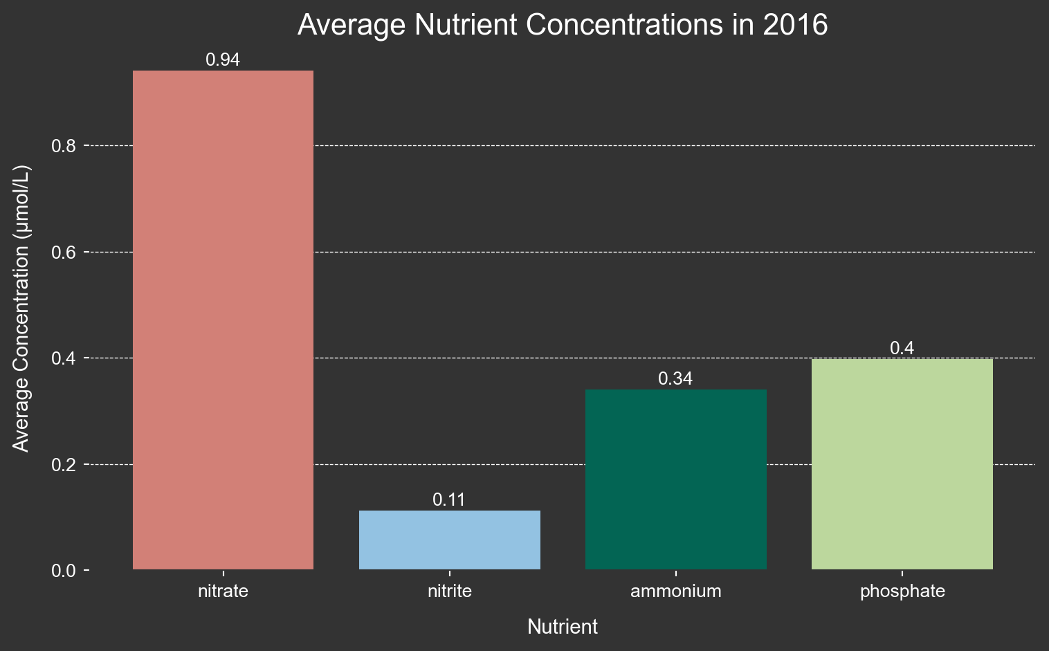
Visualizing depth data:
Next, I want to get a better understanding of ocean depth in the channel. Here I create a histogram of depths. First, though, I will need to average the depth over all time periods grouped by lat and lon. This is because depth remains constant over all years and is thus duplicated in the data set. However, I do not want duplicates in the histogram.
# Group by "lat" and "lon" and calculate the average of the "depth" column
grouped_data = full_synth_df.groupby(['lat', 'lon'])['depth'].mean().round()

# Because some grid cells overlap with land, the value is greater than zero, but I want to ceiling the data at zero.
# Convert the grouped data back to a DataFrame
grouped_df = grouped_data.reset_index()
# Replace values greater than zero with zero in the "depth" column
grouped_df['depth'] = -1 * grouped_df['depth'].apply(lambda x: 0 if x > 0 else x)

# Print the modified DataFrame
print(grouped_df)
lat lon depth
0 33.854 -120.646 1971.0
1 33.854 -120.638 1954.0
2 33.854 -120.630 1942.0
3 33.854 -120.622 1931.0
4 33.854 -120.614 1923.0
... ... ... ...
13511 34.566 -120.646 54.0
13512 34.566 -120.638 23.0
13513 34.574 -120.646 45.0
13514 34.582 -120.646 42.0
13515 34.590 -120.646 46.0
[13516 rows x 3 columns]Here I visualize the depth data in a histogram with plotly! Again, this data was originally in the form of a raster, so each measurement of depth represents a 0.008° x 0.008° grid cell.
# Calculate the histogram manually
hist, bins = np.histogram(grouped_df.depth, bins=range(0, int(grouped_df['depth'].max()) + 1, 50))
bin_centers = bins[:-1] + (bins[1] - bins[0]) / 2
bin_ranges = [f'Range: {bins[i]}-{bins[i + 1] - 1} m' for i in range(len(bins) - 1)]
hover_text = [f'{bin_ranges[i]}<br>Count: {hist[i]}' for i in range(len(bins) - 1)]


# Create the plot
fig = go.Figure()

# Plotting the data with custom colors and line styles
fig.add_trace(go.Bar(
    x=bin_centers,
    y=hist,
    hovertext=hover_text,
    hoverinfo='text',
    width=bins[1] - bins[0],
    marker_color='#02a8c9',
    marker_line=dict(color='rgba(211, 211, 211, 0.5)', width=1)
))

# Update layout for interactivity
fig.update_layout(
    xaxis_title='Average Depth (m)',
    yaxis_title='Frequency',
    title='Histogram of Depths in the Santa Barbara Channel',
    title_font=dict(family='Arial', size=22, color='white'),
    font=dict(family='Arial', size=14, color='white'),
    xaxis=dict(showgrid=False, showline=False, linewidth=1, linecolor='white'),
    yaxis=dict(showgrid=True, gridcolor='rgba(211, 211, 211, 0.5)', showline=False, linewidth=1, linecolor='white'),
    plot_bgcolor='#333333',
    paper_bgcolor='#333333',
    height=600,
    title_x=0.5,
    annotations=[
        dict(
            x=0.5,
            y=1.08,
            showarrow=False,
            text="where every data point represents 0.008° x 0.008° (approximately 1 km)",
            xref="paper",
            yref="paper",
            font=dict(family='Arial', size=14, color='white')
        )
    ]
)

# Show the interactive plot
fig.show()
Here is the depth data as a raster layer.
# Set the font family for the entire plot
rcParams['font.family'] = 'sans-serif'
rcParams['font.sans-serif'] = ['Arial']  # Use Arial font or another available sans-serif font

# Customize the figure background color, axes background color, and text color
rcParams['figure.figsize'] = (10, 8)  # Set the figure size (width, height) in inches
rcParams['figure.facecolor'] = '#333333'   # Set background color of the figure
rcParams['axes.edgecolor'] = '#333333'       # Set color of axes lines to white
rcParams['axes.labelcolor'] = 'white'      # Set color of axes labels to white
rcParams['xtick.color'] = 'white'          # Set color of x-axis ticks to white
rcParams['ytick.color'] = 'white'          # Set color of y-axis ticks to white
rcParams['text.color'] = 'white'           # Set text color to white

# Open the raster file using rasterio
with rasterio.open(raster_path) as src:
    # Set up colormap and normalization
    cmap = plt.cm.Blues_r # Reverse the Blues colormap
    cmap.set_bad(color='#333333')  # Set NaN values to be white
    norm = plt.Normalize(vmin=-1000, vmax=20)

    # Create a larger figure
    plt.figure(figsize=(9.5, 8))
    # Add "Latitude" and "Longitude" labels using plt.text
    plt.text(0.5, -0.16, 'Longitude', transform=plt.gca().transAxes,
             ha='center', color='white')
    plt.text(-0.1, 0.5, 'Latitude', transform=plt.gca().transAxes,
             va='center', rotation='vertical', color='white')

    # Plot the raster data using rasterio's show function
    rasterio.plot.show(src,
                       cmap=cmap,
                       norm=norm,
                       title='Depth in the Santa Barbara Channel',
                       origin='upper')


plt.show()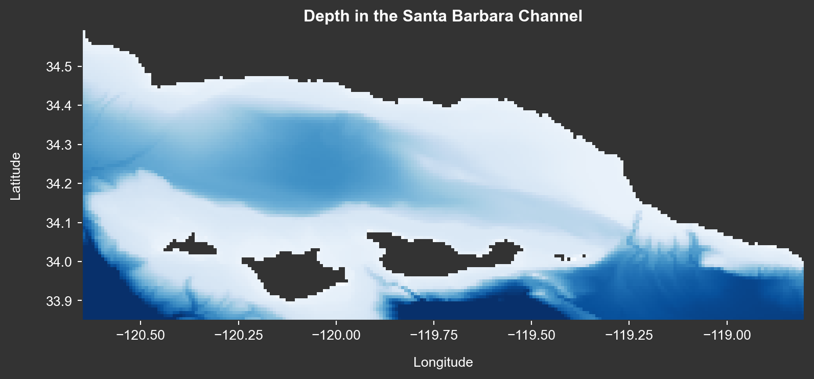
Conclusion:
Python has many great open-source tools for visualizing different types of data. Plots can quickly be made interactive with Plotly, and maps can quickly be made zoomable with Folium. Many additional packages exist to embellish visualizations in Python and should be leveraged as the need arises.
References:
1Egg, E., French, J., Patrón, J., & Windschitl, E. (2023). Developing a data pipeline for kelp forest modeling. https://github.com/kelpGeoMod/kelpGeoMod-capstone-project.