# Load necessary libraries
library(dplyr)
library(jsonlite)
library(lubridate)
library(kableExtra)Wrapped who? Visualizing my Spotify Data in Tableau
Description: Here I show the broad steps I took in Tableau to visualize my Spotify listening history in 2021/2022.
Introduction:
Who needs Spotify Wrapped when you can access your own data any time you’d like? Spotify lets users not only download a year’s worth of their own listening history through their download portal, but also pair that data with additional information in their API if so desired. In September of 2022, I decided to do the former and request a full year of my streaming history. Here, I showcase the broad steps I took to quickly wrangle the .json file in R then visualize my data in Tableau.
Methods:
I started by wrangling my data in R. I wanted to get the .json file to a .csv for ease of use in Tableau. First, though, I load a few libraries to help. dplyr helps with tidying data. jsonlite is how I read the .json file and convert to tabular. lubridate allows me to clean date-time data, and kableExtra is how I make my tables here.
Getting started in R
I pull in the first sheet of two that I received and flatten to a data frame.
#data_dir <- "set/data/dir"

# Read in the first JSON file as a data frame using the jsonlite package
music_data1 <- jsonlite::fromJSON(file.path(data_dir, "MyData/StreamingHistory0.json"), flatten = TRUE)
class(music_data1)
[1] "data.frame"music_data1 %>% slice(9996:10000) %>% kable()| endTime | artistName | trackName | msPlayed |
|---|---|---|---|
| 2022-07-08 00:45 | John Vincent III | Next to You | 256520 |
| 2022-07-08 00:48 | Edwin Raphael | Isle of Strawberries | 216370 |
| 2022-07-08 00:52 | Bon Iver | Hey, Ma | 216706 |
| 2022-07-08 00:56 | Valley Maker | No One Is Missing | 243718 |
| 2022-07-08 01:00 | Vance Joy | Mess Is Mine | 223640 |
I do the same with the second file.
# Read in the second JSON file as a data frame using the jsonlite package
music_data2 <- jsonlite::fromJSON(file.path(data_dir, "MyData/StreamingHistory1.json"), flatten = TRUE)
class(music_data2)
[1] "data.frame"music_data2 %>% slice(1:5) %>% kable()| endTime | artistName | trackName | msPlayed |
|---|---|---|---|
| 2022-07-08 01:08 | Caiola | Alaska | 225378 |
| 2022-07-08 01:08 | Ashe | Moral of the Story | 1343 |
| 2022-07-08 01:08 | Runah | Strange | 14855 |
| 2022-07-08 01:12 | Filippin | Disgrace | 3598 |
| 2022-07-08 01:12 | alt-J | Something Good | 217320 |
I combine the two data frames with an rbind, change the time from character to date-time for an estimate of when the song was played, then export to csv! You might notice below that there are additional fields in Tableau. These are fields that came from the API that I joined to my streaming data. Because I don’t actually use that in my visualization, I don’t show those steps here.
# Combine the two data frames
music_dat <- rbind(music_data1, music_data2) %>%
  # Change endTime from character to date-time
  mutate(endTime = (lubridate::ymd_hm(endTime)))

# Write
#write_csv(music_dat file.path(data_dir, "MyData/joined_dat.csv"))
Moving to Tableau
Great! Now I have a clean and easy to use data set. I could keep analyzing and visualizing in R, but Tableau makes data visualization super quick and easy. While it is less reproducible, it is fun to explore the data with Tableau in a point-and-click manner.
To start I load the data as a .csv into Tableau.

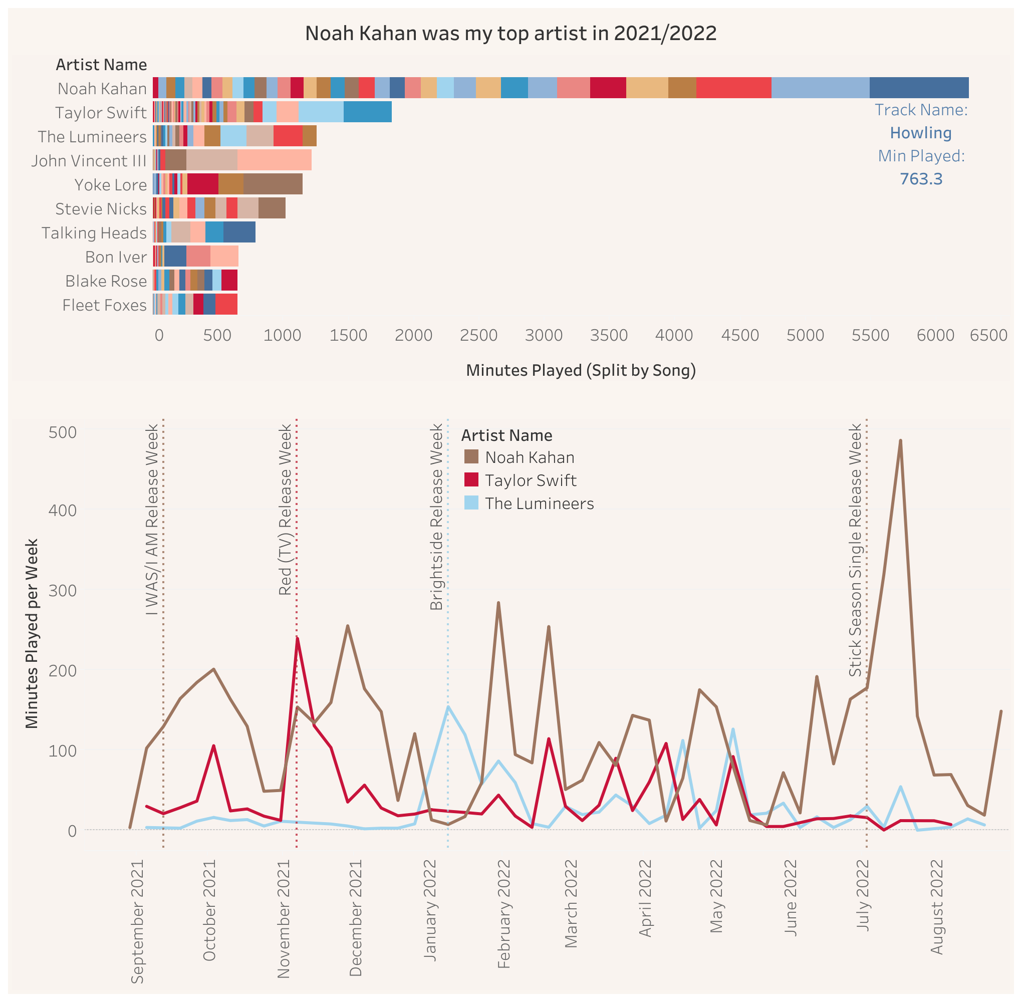
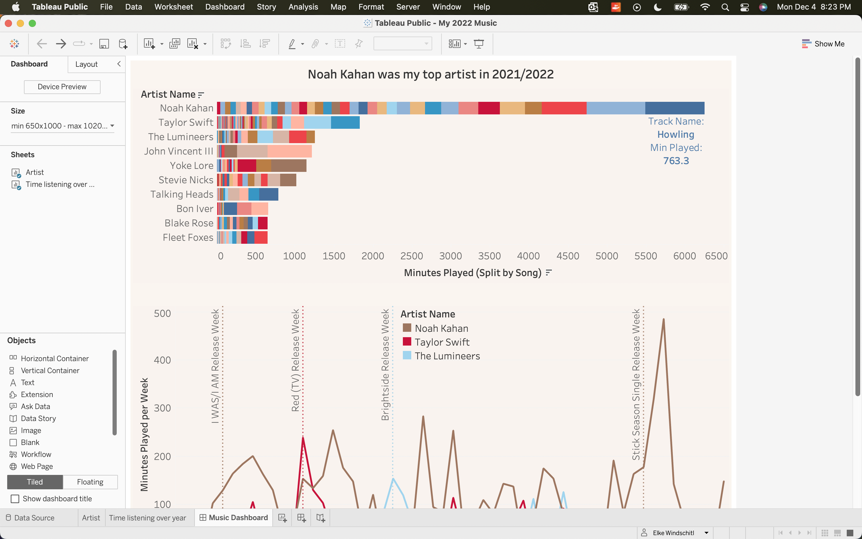
I start a workbook and explore how much time by minutes played I spent listenening to each artist. I sort by minutes played.
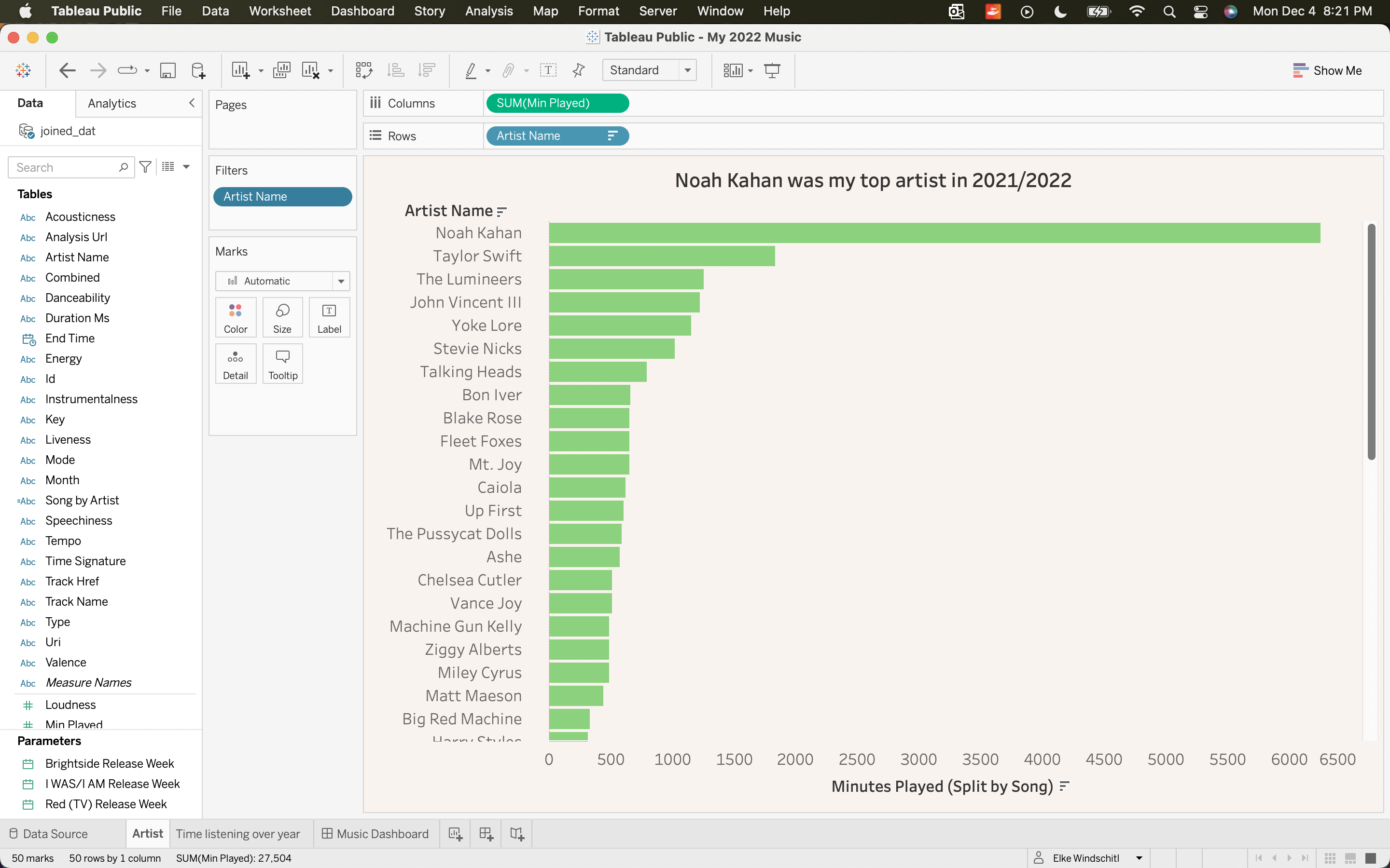
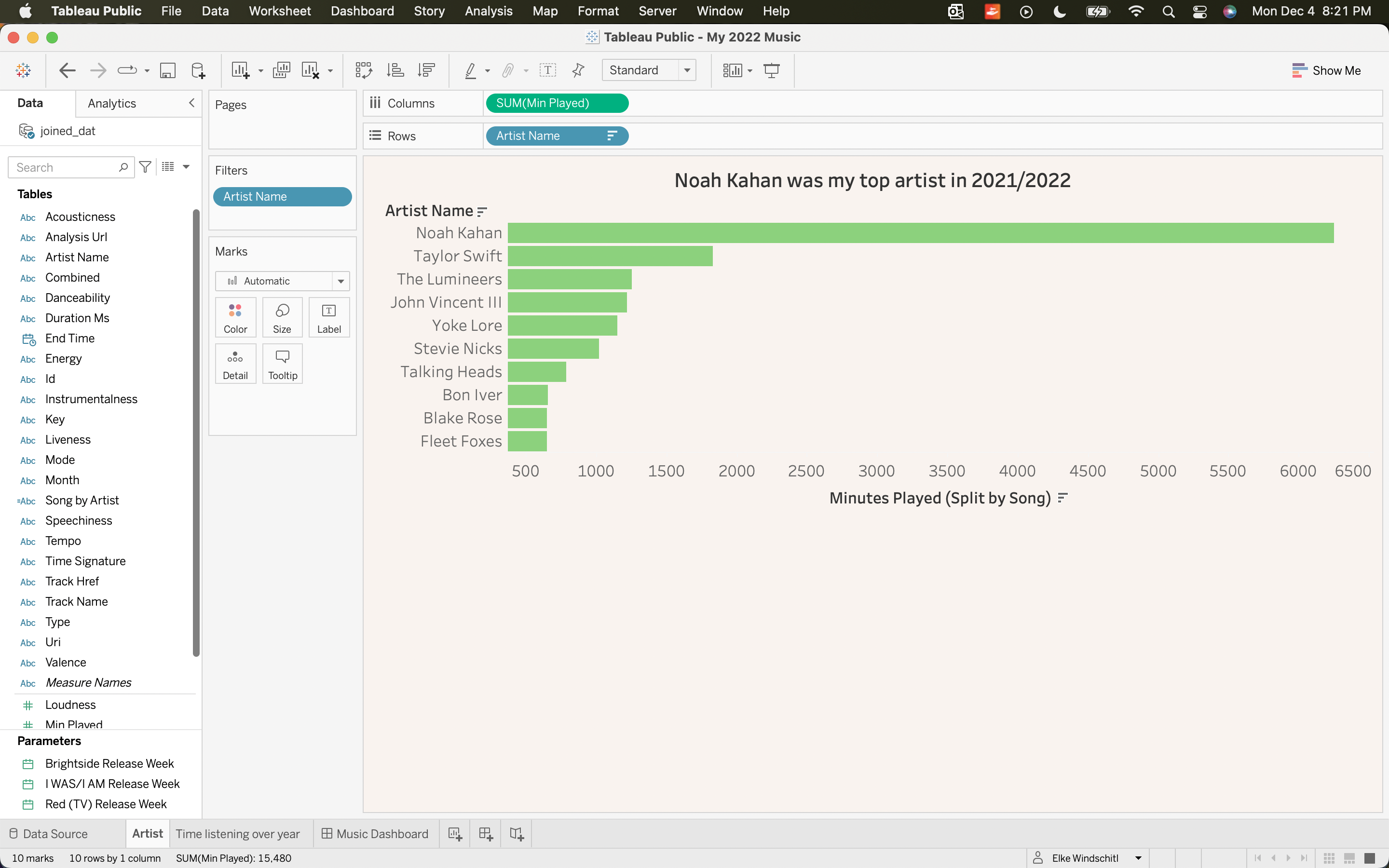
I filter to only show the top 10 artists by minutes played.
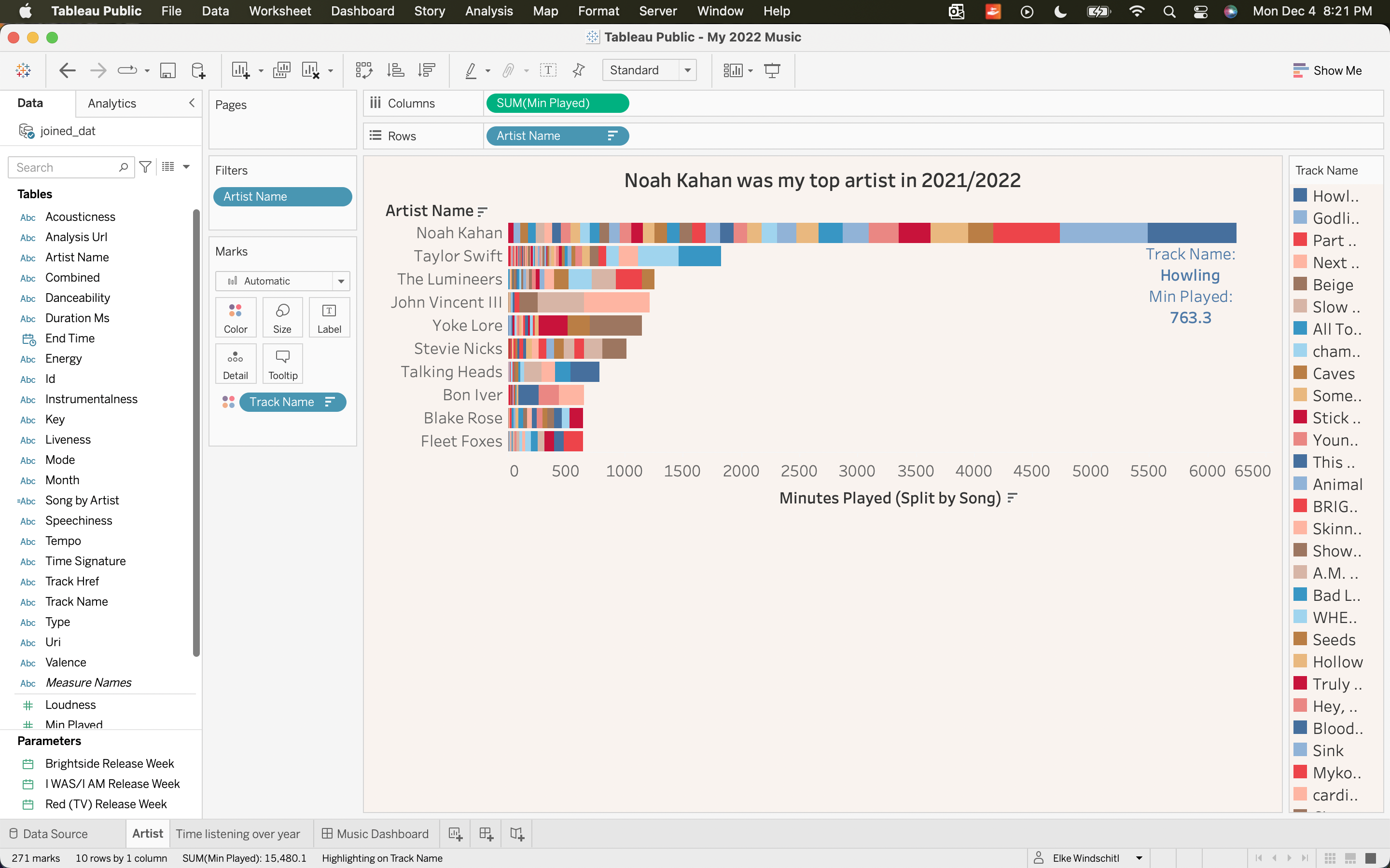
I thought it would be fun to add individual songs to the plot which is interactive in Tableau. I add Track Name as a color and annotate my most-streamed song by minutes played.
I start a second workbook and explore my minutes played throughout the year by artist.
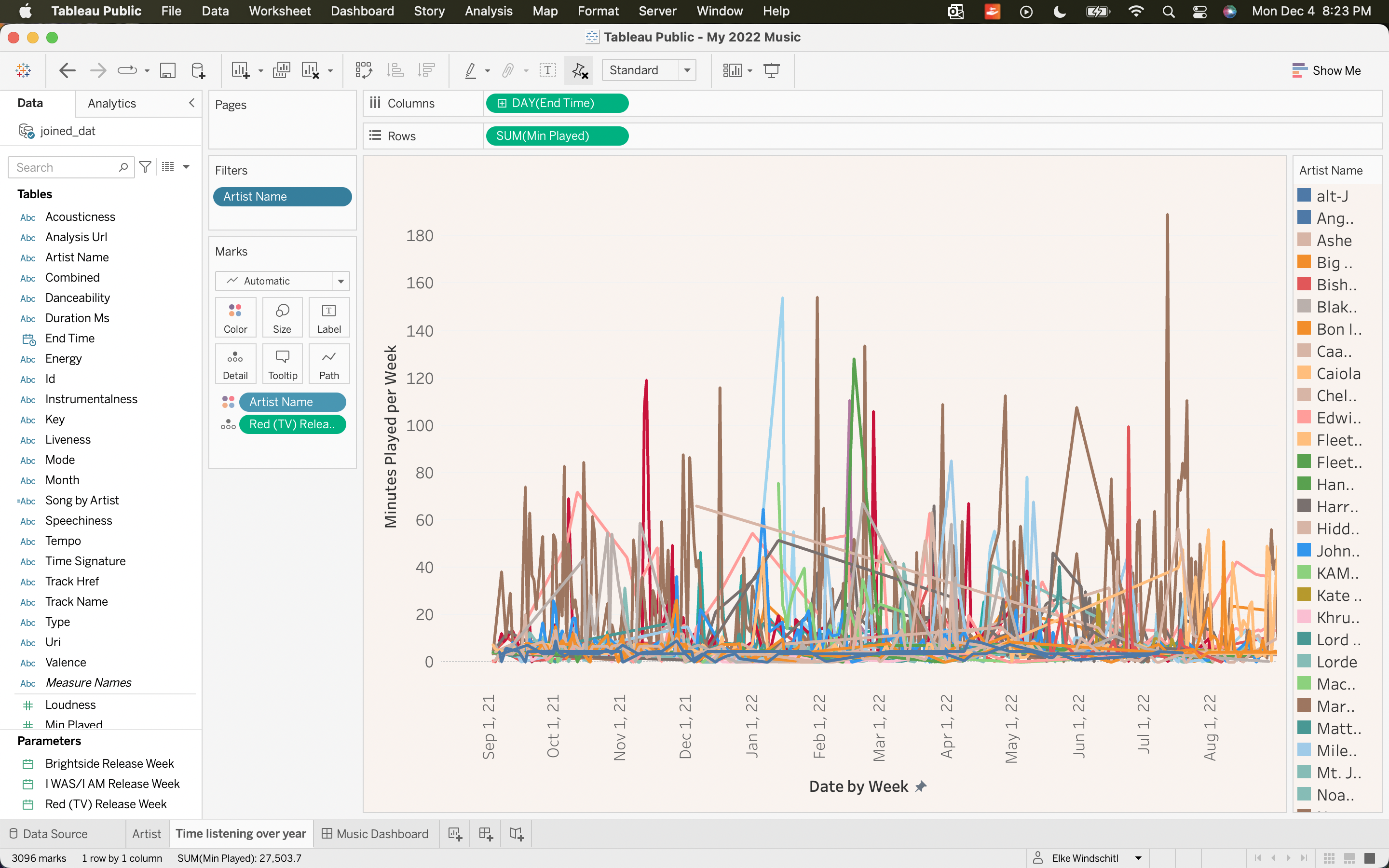
To simplify the plot, I filter to only my top three artists by minutes played.
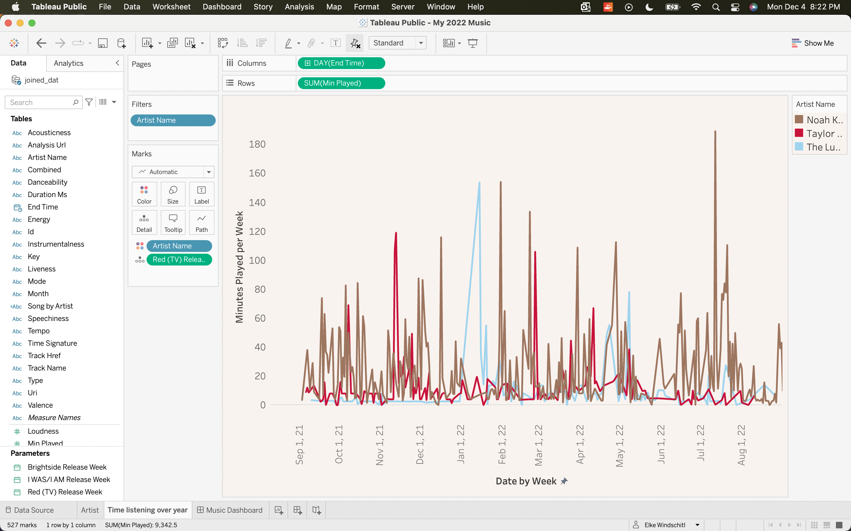
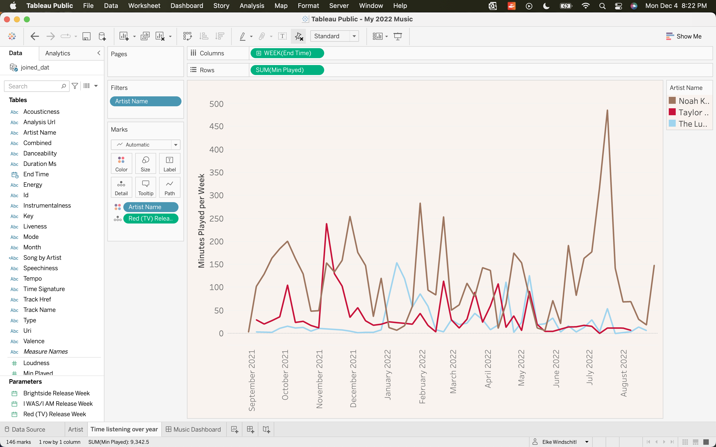
This is still a bit chaotic, so I aggregate to show minutes played per week of my top three artists.
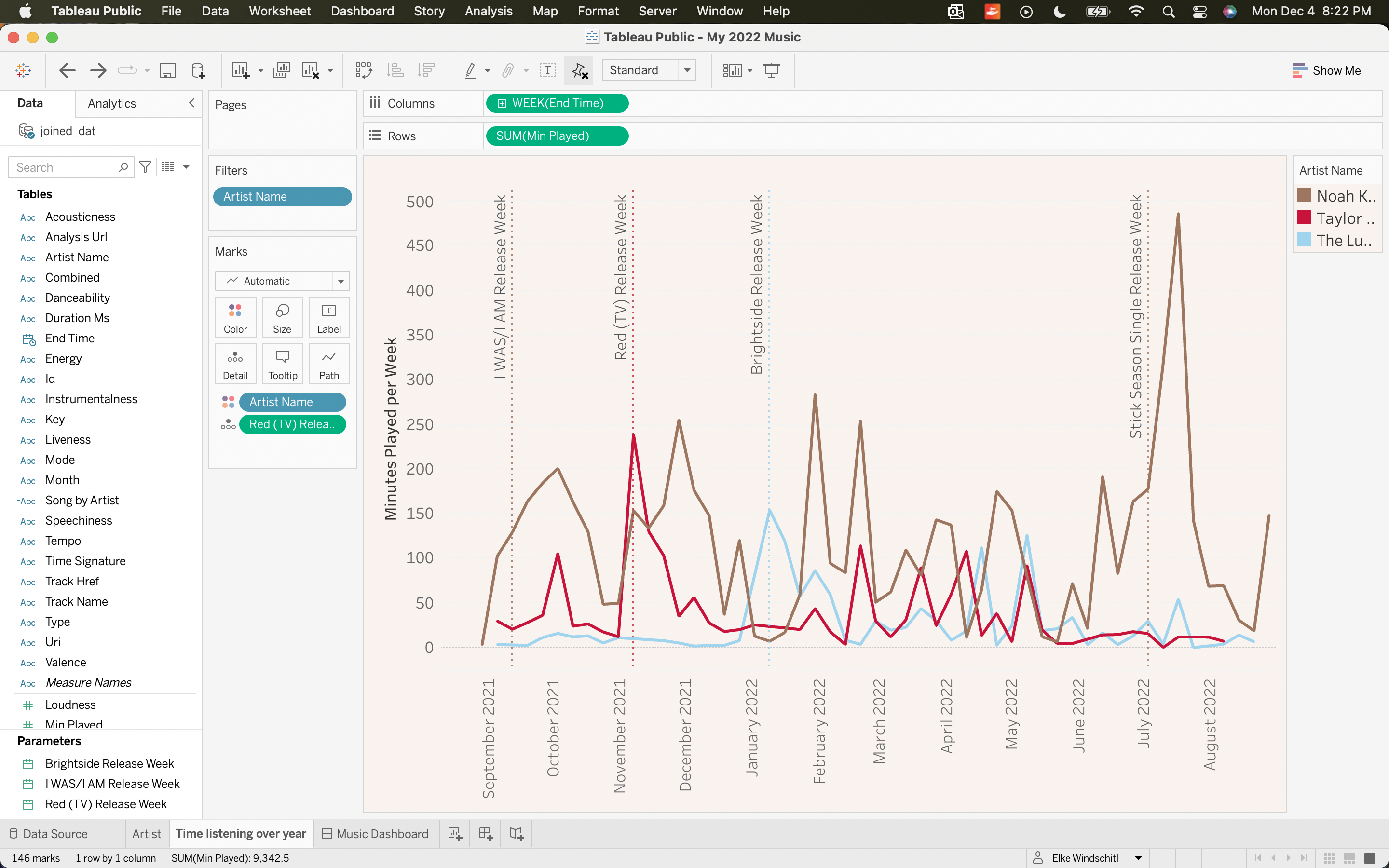
I was curious about some of these peaks. I searched the release dates of albums and singles I knew were released within this time frame. I added those dates as parameters and then added the parameters as reference lines. I am definitely a binge-listener, so some of these peaks make a lot of sense.
At this point, I am happy with these two plots! I add them together in a dashboard.
Results:
Here are the final results of my work!